Thursday 11 April 2013

Cool Schools Part 1

As an architect, or indeed any creative individual, the design or remodelling of a school or other educational facility must be one of the most exciting projects to undertake.


In this first blog of the series 'Cool Schools', we take a look at examples of educational buildings from an architectural point of view; we will look at examples of the use of colour on the external building structures. As you will see from the picture below not all of these buildings have had millions of pounds spent on them.


The Handmade School, Rudrapur

In 2002 Anna Heringer, an architecture student at Kunstuniversität, designed The Handmade School in the Bangladeshi Village of Rudrapur. Having recognised that there was a lack of educational opportunities for the villagers Anna and a group of classmates worked on the project for her master's thesis.


Preparatory School, Wahroonga


Wahroonga Preparatory School is nestled between the St Johns Uniting Church Group (NSW), a highly significant State Heritage listed group of buildings all original and well maintained, screen the school building along both street frontages. The commonwealth government’s Building the Education Revolution (BER) programme motivated the School to move forward its plans for expansion, fulfilling crucial needs for additional classrooms, library, music and art room.
read more here


Ecole Maternelle Pajol


In 2012 Palatre & Leclère, a French architecture studio redecorated the Ecole Maternelle Pajol,
a 1940′s four-classroom nursery in Paris.
read more here


Ecole Maternelle Javelot


French architects eva samuel architecte et associes reconstructed this kindergarten, 'ecole maternelle javelot', in Paris. Vibrant accent colours of window bays stand out against the modern grey exterior.


 Tellus Nursery School


Tellus nursery school lies next to the University college of Arts and Crafts at Telefonplan, Stockholm. It has been developed close to a small forest where new housing is being developed. Tellus nursery school has a semi enclosed entrance courtyard which provides an exterior space for parents and carers to drop off and pick up their children.

Panther Lake Elementary School, Washington


The Panther Lake Elementary School in Washington was designed and by DLR Group. Commissioners asked the architects to focus on their guiding principles: Learning, Safety, Relationships, and Flexibility. 

The school’s exposed steel structure, wooden frame, piping and ducts allow students to see past the surface level of the building and into its inner workings and so encourages their curiosity.


Next Blog: Cool Schools Part 2 - Corridors and Communal Areas


Thursday 4 April 2013

Getting Creative with Classroom Doors

New print technologies have allowed us to innovate interior designs for schools and colleges; tired corridors and doors like these are, thankfully, becoming a thing of the past.

Creative Teachers

For some staff, the art of display and creating a stimulating learning environment for their students is a piece of cake. Here are some examples of well thought out door designs which teachers have created for their own classrooms.


New Technologies

New build schools, academies and colleges will have been introduced to the latest digitally printed products through interior designers and architects. Large format and bespoke print has become the norm in public graphic displays, replacing traditional signage, pin boards and decorative artworks.

Case Studies

Some innovative school business managers in the North West have gone a step further and used the creative services of Impression (Bolton) Ltd. In this picture we can see that the design has been produced to enhance the existing Library doors, creating a welcoming reception area which uplifts a formerly uninviting space.


In the images below you can see that the designs have been printed directly onto the door; the bottom right image shows a Maths door in production at the Bolton print studios.
These door designs can be enhanced through the application of a surrounding vinyl graphic. For further details please contact Impression (Bolton) Ltd


Friday 22 March 2013

Feature: Creative Use of Carpet for Navigation


COLOURFUL CARPET ADDS AESTHETIC APPEAL 
AND DESIGN FLAIR TO WARRINGTON SCHOOL


Pupils at a new primary school in Warrington are benefiting from a unique and eye-catching way of helping them to identify their classrooms, thanks to colourful carpet from Heckmondwike FB.

The new Chapelford Primary School, which replaced the former Sycamore Lane Primary School, had 1000m2 of Supacord Fibre Bonded Carpet specified by SBS Architects in 10 different colours to create the vibrant floor design.  Steel Grey was used as the base colour throughout the school, whilst Magenta, Violet, Blue, Willow (Green), Aquamarine, Heather, Purple Amethyst and Mulberry were used as accent colours in the corridors and throughout all 14 classrooms. 
In such a large school, with over 300 pupils, the colourful design will help pupils to identify their classrooms whilst walking along the corridors, which are known as ‘learning streets.’ 


Peter Marshall, Architect at SBS Architects, said: “We wanted to create a vibrant design which would make it easier for pupils to find their way around the school, both inside and out.  We chose Supacord because it is available in the most vibrant array of colours allowing us to match the carpet with the external walls of the classrooms, which are visible from the playground, and making it easier for pupils to navigate the new school building.”
By using bright contrasting colours to create striking designs throughout the school, SBS Architects was also able to clearly communicate the purpose of each area to pupils and teachers and provide structure to the large open plan areas.


The connection between the classrooms and zonal areas in the corridors also encourages pupils to take ownership of the space and it is hoped that this will help to prevent bullying in the school.  The acoustic properties of Supacord will reduce noise levels in the corridors during busy periods and the clear navigational design will help to avoid congestion, keeping disruption in the school to a minimum and maintaining a relaxed and engaging atmosphere for the pupils.  Supacord is widely specified for education buildings because it is renowned for its durability, helping to withstand areas of heavy wear and tear. Supacord also offers anti-slip & antistatic properties, both of which are a major concern for schools which are looking to protect their students and their equipment.


The robust properties of fibre bonded carpet, which will not ravel or fray, allowed contractors CMC Flooring to cut the Supacord carpet on site to create the individual flooring designs, reducing the cost of installation.
Peter Marshall added: “The flooring was an important design feature of the school and so it was vital for the carpet to be high-quality and durable, to ensure that it retains its appearance and won’t be costly for the school to maintain.”  Supacord has been assessed by the Building Research Establishment (BRE) and has gained a BRE Global A+ environmental rating for use in school buildings, offices and retail outlets, which will help the school to achieve its target of a BREEAM Very Good rating.


Heckmondwike FB carpets and carpet tiles are available with full technical support, as part of the service.  All fibre bonded products are manufactured by Heckmondwike FB at its base in West Yorkshire, where the company is fully certified to ISO 14001, as part of its commitment to sustainability.

Heckmondwike FB is one of the leading carpet suppliers to the education, commercial and public sectors and is well-known for the excellent value, durability and high performance of its products. 

Sample cards for Supacord are available on request by calling +44 [0] 1924 413637 or visiting the website www.heckmondwike-fb.co.uk.


Article by Marina Wood / Rebecca Coupe
Dragonfly PR,
Tel: 01709 300130  
Email: marina@dragonflypr.co.uk / rebecca@dragonflypr.co.uk


Monday 18 March 2013

Using Colour to Zone Your School

Creative use of colour can help to define areas of your school; not only does this give departments a visual identity but helps visitors and students to navigate their way around your buildings.


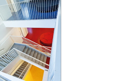
A vivid colour applied to this landing space creates a unique identity


Vinyl type and colour coding is used here as directional signage and to create departmental branding


In this block landing areas and furniture have their own colour coding and are used as break out spaces


This outdoor staircase creates a welcoming access area to an upper floor


Seating now comes in a large variety of options, use different styles and colours to define learning areas


If you run a House system use coloured seating for events and assemblies


Wednesday 13 March 2013

Thursday 28 February 2013

Creative Seating for Schools & Libraries


Your school library or an open corridor can be a great break-out area where students can explore on their own terms. Create a space where your pupils are both motivated and comfortable by exploring new seating options; kids love sitting on the floor or making dens so why not give them the creative environments they love?  Some of the world's largest business corporations such as Virgin, Google and Sony have invested in refreshing, lively office spaces using beanbags and trendy interior design because their staff enjoy working in these environments and so they are happier and more productive.


Wednesday 27 February 2013

Top Ten Tips for Great School Displays


  1. Design for the 21st Century - make your displays relevant to students’ experiences and use modern graphics
  2. Keep it simple - don’t fill your display with too many facts, faced with a board full of text students are less likely to look at all
  3. Ask questions - get your students to think more about the display by adding 3 or 4 questions
  4. Use quality resources - if you are searching images on Google to use in your display, always select ‘Large’ in the Search tools option; poor quality graphics will undermine your work.
  5. Keep it big - use a large font size so that your information can be read at a distance and by people on the move
  6. Keep changing - once students are familiar with a display it becomes ‘invisible’ so make sure you keep your room looking fresh by updating on a regular basis
  7. Think outside the box - use portable boards to use open spaces for your display, or ask your local library if you can display a project there
  8. Enhance - place a table infront of your display with relevant books and items of interest or samples of previous work
  9. Key Words - reinforce learning by adding key words to your display, use a variety of colours and font styles for these words, it will help visual learners to remember them
  10. Review - ask your students if they liked the display, whether it motivated them and if they learned from it; use their feedback to improve in the future!
For more information or to download our guide to educational displays check out our website: http://www.graphix-direct.co.uk